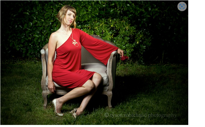
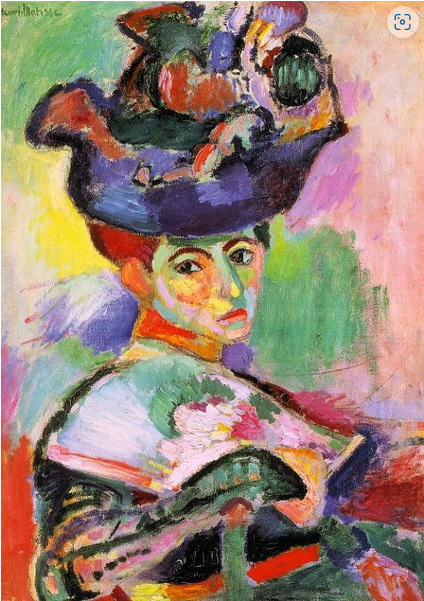
Understanding complementary color contrast can be a game-changer for photographic composition. By studying the techniques of master artists, we can refine our own creative approach. Inspired by Henri Matisse’s bold use of complementary hues, I decided to experiment with how these principles could guide a viewer’s attention in photography. To reinforce my understanding, I revisited color theory basics—even printing out a color wheel for reference—and explored how strategic color placement enhances visual impact.
In this example, I wanted to emphasize my subject—my incredibly talented friend Flora—by placing her against a deep green background and contrasting it with a vibrant complementary accent. This technique adds depth to a two-dimensional image, creating a dynamic interplay between foreground and background. A useful guideline to remember is that warm tones naturally advance, while cool tones recede, helping to shape spatial perception in a photograph.

Of course, positioning, lighting, and overall composition also play crucial roles in crafting a compelling image. But color remains one of the most powerful tools in a photographer’s arsenal—whether to highlight a focal point, soften distractions, or harmonize the elements within the frame. By thoughtfully applying complementary contrast, we can elevate a photograph from simply looking good to feeling intentional and engaging.
